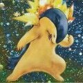
Zafur Posted June 26, 2009 Share Posted June 26, 2009 (edited) Yeah, pretty much just doodled this up as an excuse to create this thread. Better art coming later. I have more but... Hm. It uses one of my personal characters. "Realistic" Charizard... First time attempting flames. For a BS'd picture, I think it came out pretty well. Decided to see if you guys prefer him with or without the blue reflecting off his nose. Reflecting background colours is supposed to give the affect of being "in" the place they are in, instead of it just being a background but I'm not sure if it really looks better or not. In case you're interested, one in a state without scales, and the other without outlines (also missing the outline of the eye). The third both no outlines or blue. Old sketch of a cyborg Charmander. Oh, and a DP/Avie I made of a photo of a drawing I doodled in a book...If you recognize this, you now know who I am. (I might find the high res version later.) Managed to salvage it. http://i202.photobucket.com/albums/aa265/Zafurra/e3fd512d15b6eda81a9fdf4b6280c29d.jpg The Quilava in my sig was also edited by me... Even though it's imperfect. Edited July 1, 2009 by Zafur Link to comment Share on other sites More sharing options...
Loading Posted June 26, 2009 Share Posted June 26, 2009 Juat one word... WOW Link to comment Share on other sites More sharing options...
Endless Eden Posted June 26, 2009 Share Posted June 26, 2009 Nice!..........wish i chould draw.. Link to comment Share on other sites More sharing options...
Zafur Posted June 26, 2009 Author Share Posted June 26, 2009 Thanks, guys. It's pretty easy to learn. I've only been drawing for a few years. I just still have problems with drawing humans. >< Link to comment Share on other sites More sharing options...
Illithian Posted June 28, 2009 Share Posted June 28, 2009 Thanks, guys. It's pretty easy to learn. I've only been drawing for a few years. I just still have problems with drawing humans. >< Good job. Do you use Flash or Illustrator? And I assume you use a tablet, I've been meaning to look into using mine more for this type of thing. Anyway, I'll rate it. For the first Charizard, the background flames don't look all that much like flames, but you can tell it was supposed to be flames, and it actually ended up looking okay. The mouth is very well done. Scales are detailed and similar enough to show some time being put into them. Lighting confuses me; at a glance, it looks great, but with some further inspection, some parts of it that should be lighter are in shadow. (Mainly on the back, based on where the light is coming from. I think since the background is so contrasting, its probably better without the blue reflecting on the nose. I think the one without scales looks a little better, and stays more true to the original charizard, but the scales make it look much more realistic, and they are well done. Without outlines is better then I'd expect around the body and face, but definitely not the mouth. I like the pencilled Quilava drawing as well. Charmander just looks messed up with all the sketching lines, but theres a ton of potential there. Link to comment Share on other sites More sharing options...
Zafur Posted June 30, 2009 Author Share Posted June 30, 2009 Actually, Photoshop Elements... Version 7, I think. And yup, a tablet. They're a bit addicting though. I haven't really touched traditional art in a while... I blame Ctrl+Z. I wasn't really trying on the flames, as it was done after I had already finished the charizard, and figured I should stick in a last minute back ground... Actually, everything after finishing the colouring on the Charizard himself is "last minute". I have a tendency to not try as much on small things I add on afterwards when they already look good enough. Which is why I consider this a "doodle". I feel like it could be much better if I spent more time on the details. I'm surprised you say that the scales look good. They are extremely messy to me. I'll try not to let that encourage my lazyness. I don't blame you for being confused on the lighting. This is my first picture trying to use a more "painted" approach as opposed to minor Cell Shading, and as the background was a last minute addition, I wasn't concentrating on having an illumination from behind, more of from the generic top right cornerish position. Thanks for the opinion on the blue reflection or not, as it wasn't originally going to be there until I remembered reading about using background colours in reflection/highlights and shading. Guess it's not really worth it if I don't keep that in mind during the whole process. And, really, it was never meant to be seen without the outlined layer, or scales, which is why the mouth looks like that. I just coloured underneath the lines then decided to see how it looked without them, expecting much more of a mess. Ugh, I hate how most of the above seems like me giving excuses. O_o Actually, the pencil drawing is an Umbreon. Did you just get confused with the mention of Quilava right under it? I thought the ring on it's head showed through well enough. And the Charmander wasn't intended as a serious drawing, which is why I never cleaned it up. More of a pure for fun thing than actually challenging myself. I'll work on trying to get more actual art rather than just playing around with layers. Link to comment Share on other sites More sharing options...


Recommended Posts
Create an account or sign in to comment
You need to be a member in order to leave a comment
Create an account
Sign up for a new account in our community. It's easy!
Register a new accountSign in
Already have an account? Sign in here.
Sign In Now